Components
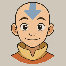
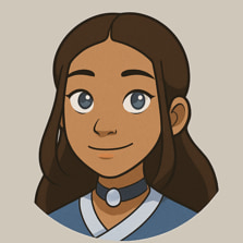
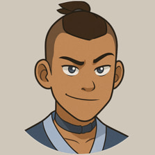
Avatar
An image element with a fallback for representing the user.
Usage 

Sizes 
Square shape 
With notifications 
Grouped 
Grouped with counter 
+99
Component arguments 
Avatar 
| Argument | Type | Description |
|---|---|---|
src |
str |
Optional. URL of the image to use as the avatar. |
alt |
str |
Optional. Text to show if the image is not defined or it doesn't load. |
size |
str |
Optional. The size of the avatar. Can be one of: small, medium, large, or xlarge. Default is medium. |
href |
str |
Optional. Pass this argument to make the avatar a link. |
square |
bool |
Optional. If set to true, the avatar will be rounded square instead of a circle. Default is false. |
on |
bool |
Optional. If set to true, the avatar will show a notification dot. Default is false. |
off |
bool |
Optional. If set to true, the avatar will show an empty notification dot. Default is false. |
Avatar.Group 
No arguments.
Components 
Component |
File |
Source |
|---|---|---|
Avatar |
avatar/index.jinja |
|
Avatar.Group |
avatar/group.jinja |
|
avatar/avatar.css |